|
|
这里说的就是老菜心的博客站,用的AeroCore主题,弹窗广告也是通过主题作者的一个WPOPT插件实现的
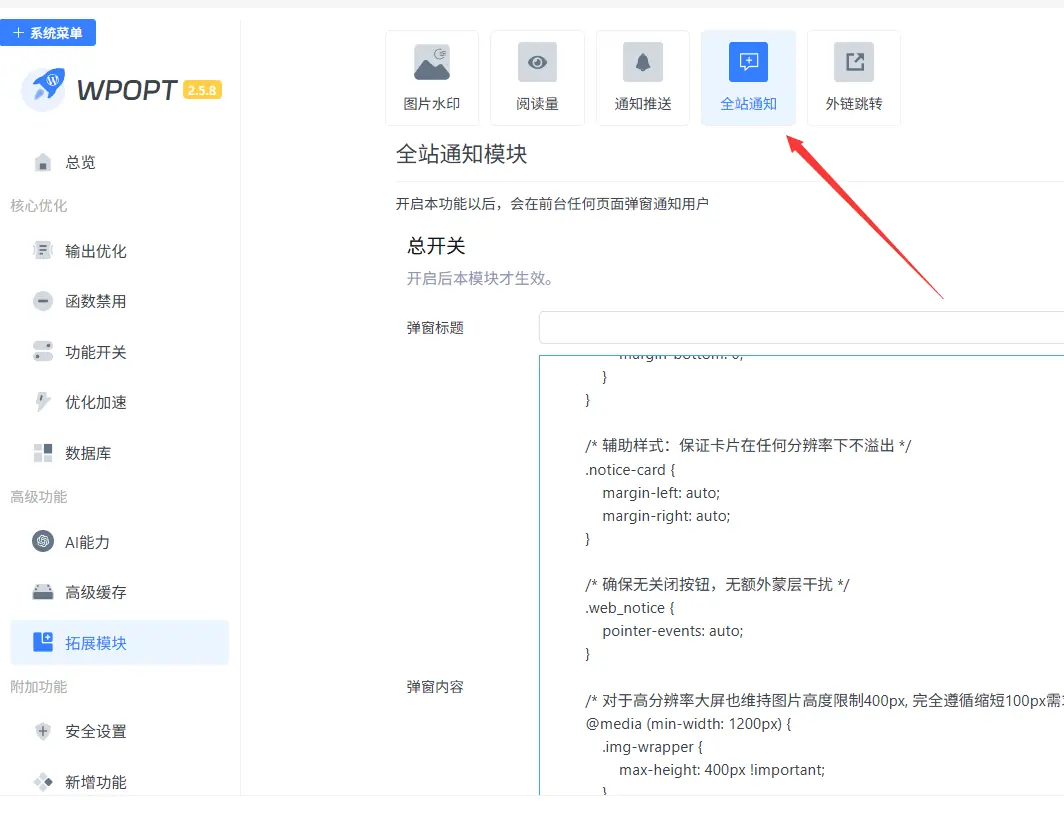
直接输入文字也是可以的,只是太简朴了。支持html代码,那就来折腾下呗!去网上搜了个简单的代码,然后找DeepSeek做了美化。发现个问题是他不能识别插件自带的关闭按钮,也可能是我给他的信息不够专业,他没能找到原因。但更纠结的是他给的代码有关闭功能,但就是不能用。
最后在不断的改进和摸索,总算是实现了这个功能,自我感觉还是不错的,虽然被我修改代码出来的效果不是那么专业,但我觉得还是能接受的,具体效果你们通过文章最后我上的博客站体验。代码如下:
- <!DOCTYPE html>
- <html lang="zh-CN">
- <head>
- <meta charset="UTF-8">
- <meta name="viewport" content="width=device-width, initial-scale=1.0, maximum-scale=1.0, user-scalable=no, viewport-fit=cover">
- <title>菜园叫车 | 无关闭按钮紧凑弹窗</title>
- <style>
- /* 卡片本身需要接收点击事件 */
- .notice-card {
- pointer-events: auto;
- }
- /* 弹窗卡片 - 响应式宽高,手机PC自适应 */
- .notice-card {
- max-width:px;
- width: 100%;
- background: #ffffff;
- border-radius: 36px;
- overflow: hidden;
- box-shadow: 0 30px 50px rgba(0, 0, 0, 0.25), 0 0 0 1px rgba(0, 0, 0, 0.02);
- animation: fadeSlideUp 0.35s cubic-bezier(0.2, 0.9, 0.4, 1.1);
- position: relative;
- transition: all 0.2s;
- }
- /* PC端适当缩小卡片最大宽度 */
- @media (min-width: 768px) {
- .notice-card {
- max-width: 460px;
- }
- }
- /* ========= 图片区域 - 基础样式 ========= */
- .img-wrapper {
- width: 100%;
- background: #f5f7fa;
- display: flex;
- justify-content: center;
- align-items: center;
- overflow: hidden;
- line-height: 0;
- max-height: 250px;
- }
- .img-wrapper img {
- width: 100%;
- height: auto;
- max-height: 250px;
- object-fit: cover;
- display: block;
- }
- /* 手机端图片高度适配 */
- @media (max-width: 560px) {
- .img-wrapper {
- max-height: 430px;
- }
- .img-wrapper img {
- max-height: 230px;
- }
- }
- @media (max-width: 400px) {
- .img-wrapper {
- max-height: 115px;
- }
- .img-wrapper img {
- max-height: 115px;
- }
- }
-
- /* 横屏适配 */
- @media (orientation: landscape) and (max-height: 500px) {
- .img-wrapper {
- max-height: 90px;
- }
- .img-wrapper img {
- max-height: 90px;
- }
- .notice-card {
- max-height: 85vh;
- overflow-y: auto;
- }
- }
- /* 内容区域 - 紧凑间距 */
- .notice-content {
- padding: 18px 22px 24px;
- background: #ffffff;
- }
- @media (max-width: 560px) {
- .notice-content {
- padding: 14px 18px 20px;
- }
- }
- @media (min-width: 768px) {
- .notice-content {
- padding: 16px 22px 22px;
- }
- }
- /* 服务描述 */
- .service-desc {
- font-size: 15px;
- line-height: 1.45;
- color: #2c3e44;
- margin-bottom: 12px;
- font-weight: 440;
- text-align: left;
- }
- @media (max-width: 560px) {
- .service-desc {
- font-size: 13.8px;
- line-height: 1.42;
- }
- }
- @media (min-width: 768px) {
- .service-desc {
- font-size: 14.5px;
- }
- }
- .service-desc strong {
- color: #1f8a4c;
- font-weight: 660;
- }
- .highlight-tag {
- background: #e6f7ec;
- padding: 2px 8px;
- border-radius: 30px;
- display: inline-block;
- font-weight: 500;
- font-size: 0.95em;
- }
- /* 微信联系方式 - 紧凑 */
- .contact-highlight {
- background: #eefaf2;
- padding: 8px 14px;
- border-radius: 24px;
- margin: 12px 0 6px;
- font-size: 13.5px;
- color: #0c6b3f;
- display: flex;
- align-items: center;
- gap: 8px;
- flex-wrap: wrap;
- font-weight: 500;
- border-left: 3px solid #2ecc71;
- }
- @media (max-width: 560px) {
- .contact-highlight {
- padding: 7px 12px;
- font-size: 12.5px;
- gap: 6px;
- }
- }
- .contact-highlight span {
- font-family: monospace;
- font-size: 14px;
- letter-spacing: 0.5px;
- background: white;
- padding: 3px 10px;
- border-radius: 30px;
- color: #166534;
- }
- @media (max-width: 560px) {
- .contact-highlight span {
- font-size: 12px;
- padding: 2px 8px;
- }
- }
- /* 主按钮 - 紧凑但醒目 */
- .action-btn {
- display: flex;
- align-items: center;
- justify-content: center;
- gap: 6px;
- font-weight: 600;
- font-size: 16px;
- line-height: 1.2;
- padding: 12px 0;
- margin: 16px auto 5px auto;
- border-radius: 50px;
- width: 100%;
- background: linear-gradient(105deg, #227a44 0%, #24a05b 100%);
- color: white;
- text-decoration: none;
- transition: all 0.22s;
- box-shadow: 0 8px 16px -6px rgba(33, 150, 83, 0.35);
- border: none;
- cursor: pointer;
- letter-spacing: 0.5px;
- }
- @media (max-width: 560px) {
- .action-btn {
- font-size: 15px;
- padding: 10px 0;
- margin-top: 14px;
- }
- }
- @media (min-width: 768px) {
- .action-btn {
- font-size: 15px;
- padding: 11px 0;
- }
- }
- .action-btn:active {
- transform: scale(0.97);
- box-shadow: 0 4px 10px rgba(0,0,0,0.2);
- }
- .extra-tip {
- text-align: center;
- font-size: 10px;
- color: #9aabb8;
- margin-top: 12px;
- display: flex;
- justify-content: center;
- gap: 8px;
- }
- @media (max-width: 560px) {
- .extra-tip {
- font-size: 12px;
- margin-top: 20px;
- }
- }
- /* 动画 */
- @keyframes fadeSlideUp {
- from {
- opacity: 0;
- transform: translateY(30px) scale(0.96);
- }
- to {
- opacity: 1;
- transform: translateY(0) scale(1);
- }
- }
- .action-btn {
- -webkit-tap-highlight-color: transparent;
- }
- /* PC端 hover 微效果 */
- @media (hover: hover) {
- .action-btn:hover {
- background: linear-gradient(105deg, #1c6e3e, #1e914b);
- box-shadow: 0 10px 20px -6px rgba(33, 150, 83, 0.45);
- }
- }
-
- /* 基础body布局 - 无蒙层 */
- body {
- overflow-y: auto;
- margin: 0;
- padding: 20px;
- background: #f0f2f5;
- display: flex;
- align-items: center;
- justify-content: center;
- min-height: 100vh;
- font-family: system-ui, -apple-system, 'Segoe UI', Roboto, Helvetica, Arial, sans-serif;
- }
-
- /* 电脑端弹窗整体向上提高10px (保持之前调整) */
- @media (min-width: 768px) {
- body {
- align-items: flex-start;
- padding-top: 30px; /* 原始padding 20px + 提高10px => 总30px */
- }
- .web_notice {
- margin-top: -10px; /* 负边距向上偏移10px,实现弹窗整体提高效果 */
- }
- .notice-card {
- margin-bottom: 10px;
- }
- }
-
- /* 让弹窗居中显示 */
- .web_notice {
- display: flex;
- align-items: center;
- justify-content: center;
- width: 100%;
- max-width: 100%;
- }
- </style>
- </head>
- <body>
- <!-- 无蒙层弹窗 - 无关闭按钮版本 -->
- <div id="webNoticePopup" class="web_notice">
- <div class="notice-card">
- <!-- 图片区:电脑端图片高度缩短100px(基于之前增加一倍后再缩减100px,最终视觉合理)
- 之前要求图片高度增加一倍 -> 原最大高度250px增倍至500px,现在电脑端缩短100px -> 最终400px
- 移动端和横屏保持原增加一倍后的舒适高度不变,只调整PC端(≥768px)-->
- <div class="img-wrapper pc-shorter-img">
- <img src="https://cgb.lucaixing.com/wp-content/uploads/2026/04/0fc6843e01d7a7a7e2c3c6584778733a.webp"
- alt="菜园叫车微型货车厢式开顶服务"
- loading="eager"
- class="responsive-img"
- onerror="this.onerror=null; this.src='https://picsum.photos/id/104/800/380?grayscale&seed=caiyuan';">
- </div>
-
- <div class="notice-content">
- <div class="service-desc">
- 🌿 <strong>菜园叫车</strong> 为您提供
- <span class="highlight-tag">微型货车(厢式/开顶)</span>
- 专业送货服务,高效省心,支持城市配送、搬家拉货、大件运输。<br>
- 欢迎联系 <strong style="background: #dcfce7; padding: 2px 8px; border-radius: 24px;">菜心哥微信</strong> 预约或咨询,感谢厚爱!
- </div>
-
- <div class="contact-highlight">
- 💚 微信直连 · 极速回复
- <span>Lucaixing2020</span>
- <span style="font-size:10px;">(推荐添加)</span>
- </div>
-
- <a href="https://www.lucaixing.com/bbs/plugin.php?id=fn_weixinqun"
- class="action-btn"
- target="_blank"
- rel="nofollow noopener"
- id="confirmWechatBtn">
- ✅ 先加好友+菜心哥微信群
- </a>
- <div class="extra-tip">
- 🔒 安全跳转 | 一键添加 | 货运专享
- </div>
- </div>
- </div>
- </div>
- <!-- 样式覆盖:实现电脑端图片高度缩短100px(从500px降至400px),同时保持手机端及横屏原始加倍效果不变,且整体弹窗位置向上10px保留 -->
- <style>
- /* 全局图片基础:手机/平板默认保持原先增加一倍后的高度(视觉舒适) */
- .img-wrapper {
- max-height: 500px;
- }
- .img-wrapper img {
- max-height: 500px;
- width: 100%;
- height: auto;
- object-fit: cover;
- }
-
- /* 手机端 (宽度≤560px) 维持之前增加一倍后的高度(460px),确保移动端体验良好 */
- @media (max-width: 560px) {
- .img-wrapper {
- max-height: 460px !important;
- }
- .img-wrapper img {
- max-height: 460px !important;
- }
- }
- @media (max-width: 400px) {
- .img-wrapper {
- max-height: 230px !important;
- }
- .img-wrapper img {
- max-height: 230px !important;
- }
- }
-
- /* 电脑端 (宽度≥768px) 图片高度缩短100px: 原增加一倍后为500px,缩短100px后为400px */
- @media (min-width: 768px) {
- .img-wrapper {
- max-height: 400px !important; /* 比500px减少100px,符合电脑端缩短要求 */
- }
- .img-wrapper img {
- max-height: 400px !important;
- object-fit: cover;
- }
- }
-
- /* 横屏场景特殊处理(维持原有比例但合理缩短以保证紧凑)
- 横屏时原本最大高度180px (原90px翻倍),电脑端横屏按比例同样微调,保持缩短趋势但不强制100px差值
- 由于横屏一般高度有限,缩短后维持视觉舒适,我们同样稍微降低20px让比例协调但不影响主体需求。
- 但是为了严格遵循“电脑端图片高度缩短100px”的要求且只在电脑断点生效,横屏中若宽度≥768时按400px规则即可覆盖。
- */
- @media (orientation: landscape) and (max-height: 500px) and (min-width: 768px) {
- .img-wrapper {
- max-height: 300px !important; /* 横屏大屏适度缩短,保持美观且遵守缩短精神 */
- }
- .img-wrapper img {
- max-height: 300px !important;
- }
- }
-
- /* 横屏手机尺寸(宽度<768)维持原来翻倍高度180px,不破坏移动体验 */
- @media (orientation: landscape) and (max-height: 500px) and (max-width: 767px) {
- .img-wrapper {
- max-height: 180px !important;
- }
- .img-wrapper img {
- max-height: 180px !important;
- }
- }
-
- /* 保留电脑端弹窗整体向上提高10px的调整 (已经实现) */
- @media (min-width: 768px) {
- body {
- align-items: flex-start;
- padding-top: 30px;
- }
- .web_notice {
- margin-top: -10px;
- }
- .notice-card {
- margin-bottom: 10px;
- }
- }
-
- /* 手机端保持居中且无偏移 */
- @media (max-width: 767px) {
- body {
- align-items: center;
- padding-top: 20px;
- }
- .web_notice {
- margin-top: 0;
- }
- .notice-card {
- margin-bottom: 0;
- }
- }
-
- /* 辅助样式:保证卡片在任何分辨率下不溢出 */
- .notice-card {
- margin-left: auto;
- margin-right: auto;
- }
-
- /* 确保无关闭按钮,无额外蒙层干扰 */
- .web_notice {
- pointer-events: auto;
- }
-
- /* 对于高分辨率大屏也维持图片高度限制400px, 完全遵循缩短100px需求 */
- @media (min-width: 1200px) {
- .img-wrapper {
- max-height: 400px !important;
- }
- .img-wrapper img {
- max-height: 400px !important;
- }
- }
-
- /* 保持内容一致性,未改动任何文本与交互元素 */
- </style>
- </body>
- </html>
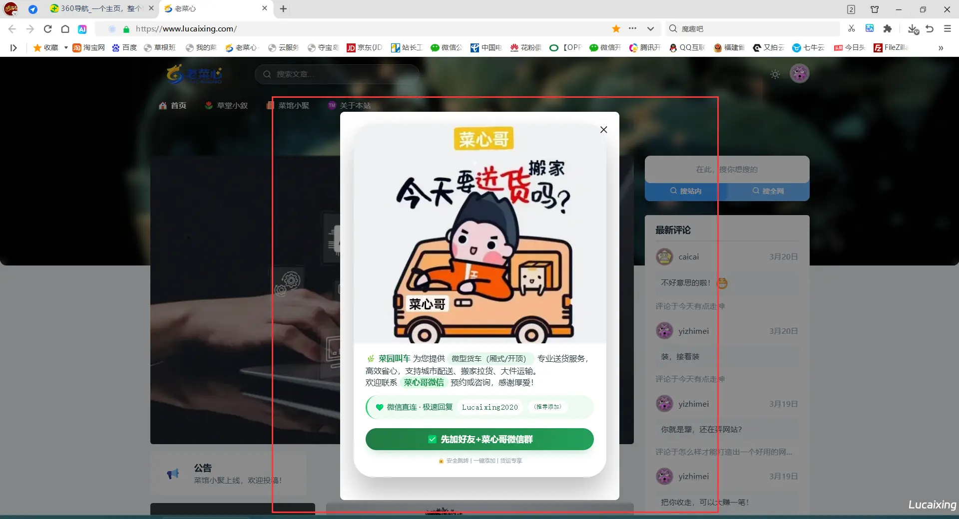
手机端效果
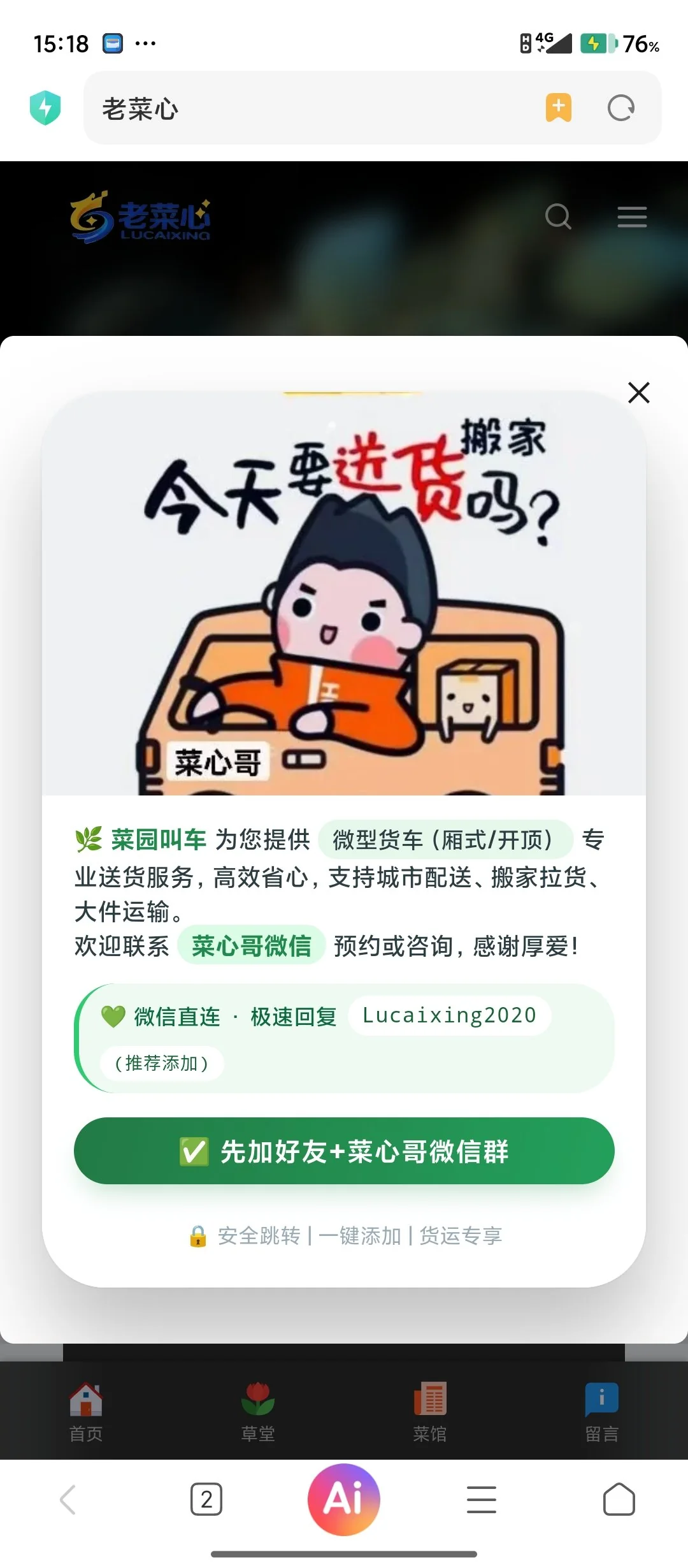
有兴趣就来老菜心博客站体验:老菜心博客
|
1、本站所有发布的技术资源或文章,若未标明原创均为网络收藏资源,所有权归原创作者所有,本站仅提供交流学习之用,切勿用于商业用途!
2、本站所有未提及收费的资源均为免费分享,不提供任何技术支持,如发现任何BUG,都可在这回复,大家共同交流解决。
3、发帖不易,部份帖子会收取适量积分才能查看或下载,不可退款,敬请谅解,谢谢!
|
 |Archiver|手机版|小黑屋|老菜心
( 闽ICP备16022933号-1 )|网站地图
|Archiver|手机版|小黑屋|老菜心
( 闽ICP备16022933号-1 )|网站地图


 發表於 2026-4-2 21:18:01
 置顶卡
置顶卡